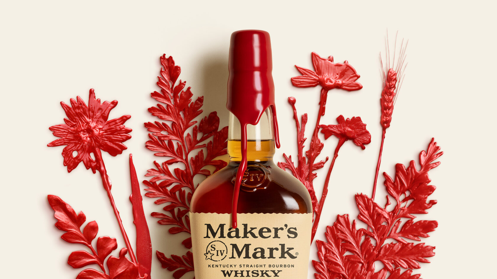
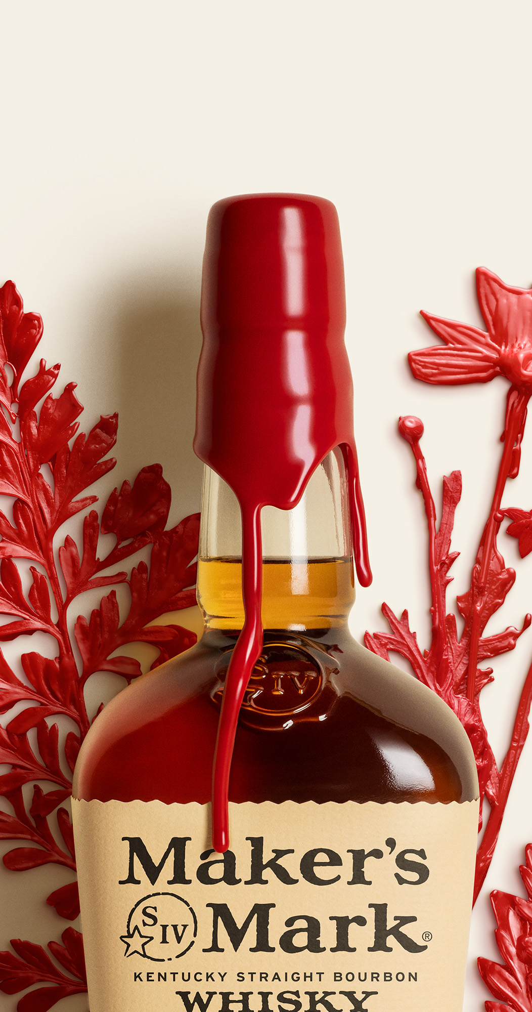
Nothing worth doing well ever happens in a hurry. That’s always been the Maker’s Mark spirit at Star Hill Farm. A bourbon, bottle and brand that was thoughtful, tactile and carefully made. Where every barrel is hand-rotated, every label hand-cut, every bottle hand-dipped in distinctive red wax. Where value is placed on doing things the right way, even if it’s the long way. And value is placed, too, on looking after the land and nature that brings flavour to every drop through regenerative distilling practices.
The new identity reflects this commitment by re-envisioning that original sensibility. So Maker’s Mark feels more considered, more elevated, yet deeply itself.

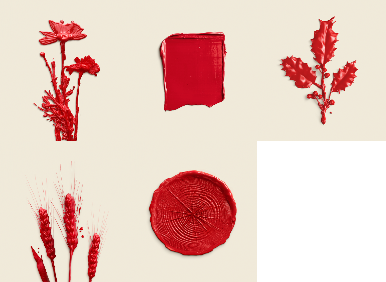
This commitment led us to make the identity the Maker’s way: by hand and from land. Dipping and casting elements from Star Hill Farm and the production process in the same unmistakable red wax to tell the brand’s stories.
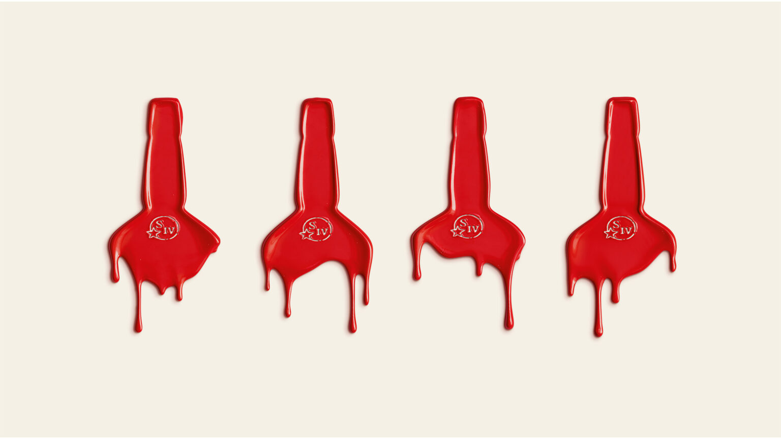
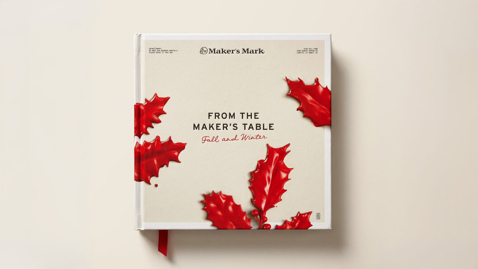
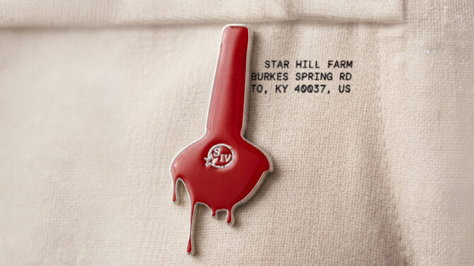
The iconic red top is now coined in print and cast in wax across four marks, each capturing the individuality of every dipped bottle.
Marks of the land tell the stories behind the taste and quality of the liquid: soft red winter wheat, ageing in American white oak, and the thriving nature supported by B-Corp and Regenerative practices that shape the terroir and give the liquid its distinctive flavour.
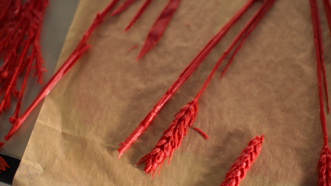

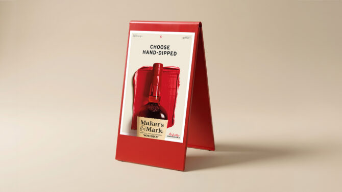
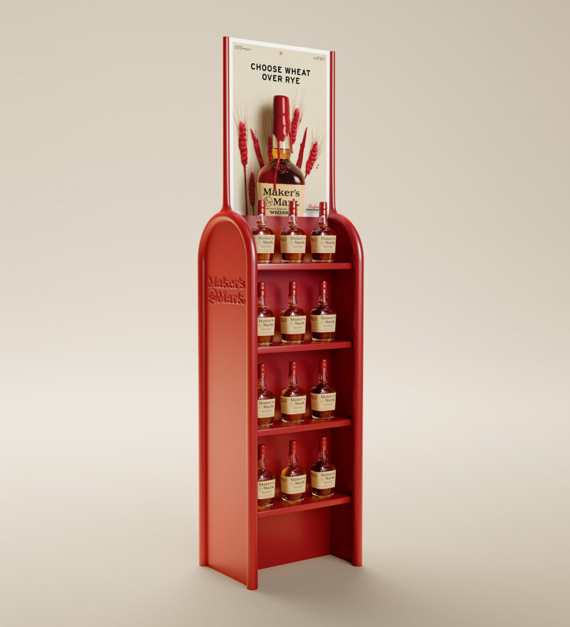
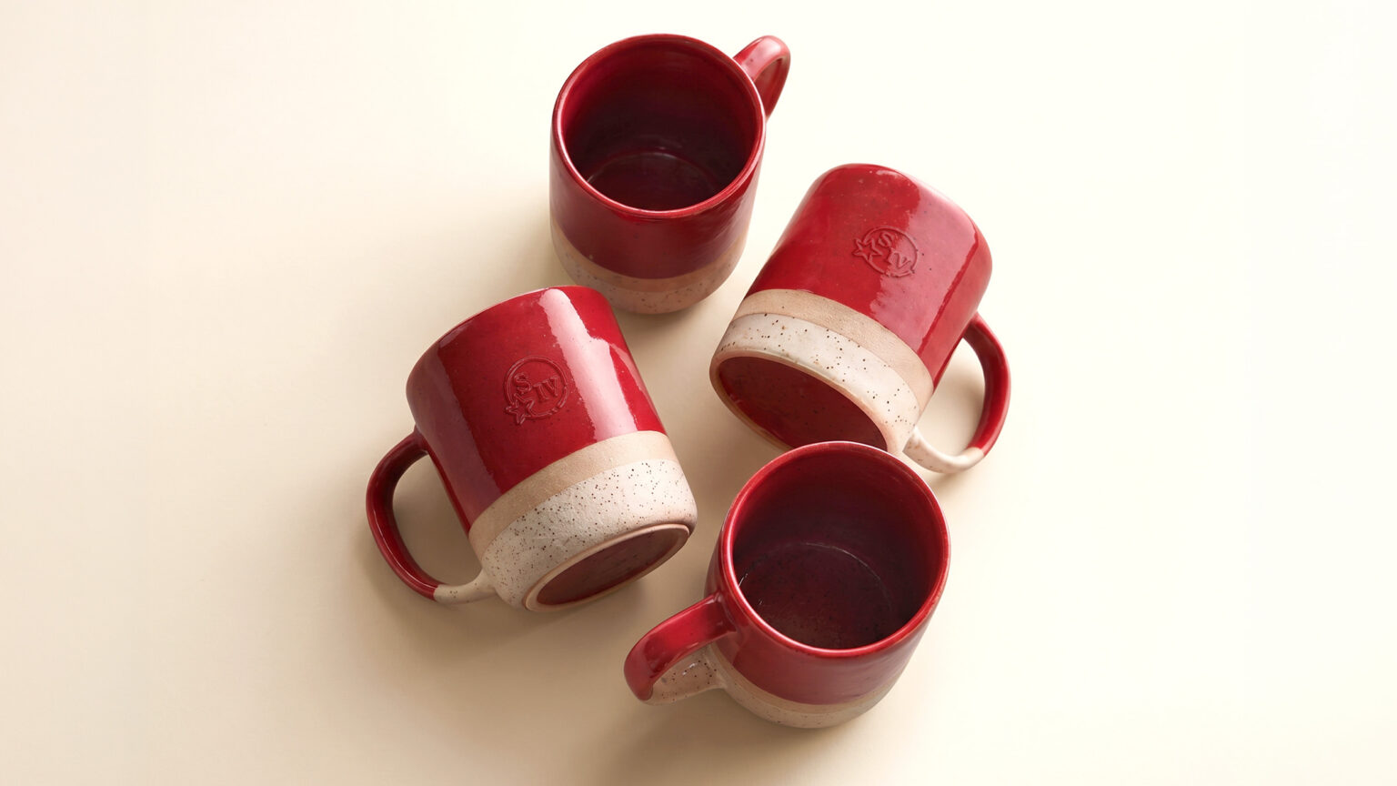
Throughout the brand world, red carries the memory of the wax in finish and in form: powder-coated metal, glazing and varnish are all applied to objects with smooth, flowing forms.
In photography, we can tell deeper, richer stories of craftsmanship and of being part of nature at Star Hill Farm. Warm cream grading and natural light tie our world together alongside touches of glossy, wax-like red.
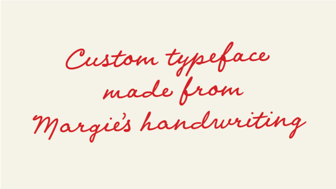
It was the eye of co-founder, Margie Samuels, who shaped Maker’s iconic bottle. To honour her role and bring proximity to Margie as a maker, we authentically recreated her handwriting. This brings her voice and understated wit to the brand through a flowing, wax-like custom typeface – and because making things well is always time well spent. Margie’s handwriting was made with hundreds of characters, contextual alternates and ligatures – making it feel more genuine and convincingly handmade.
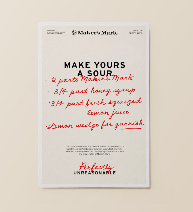
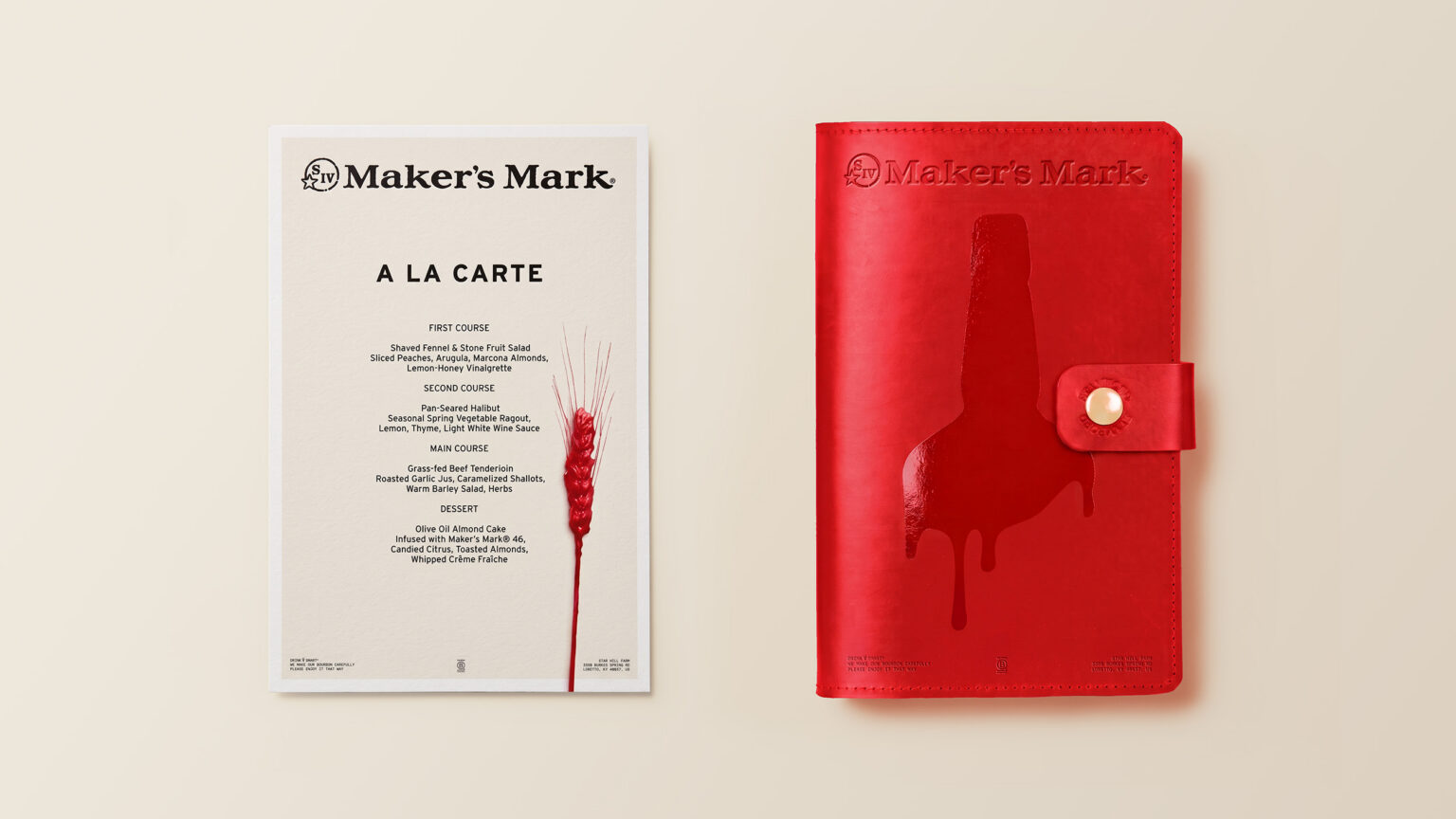
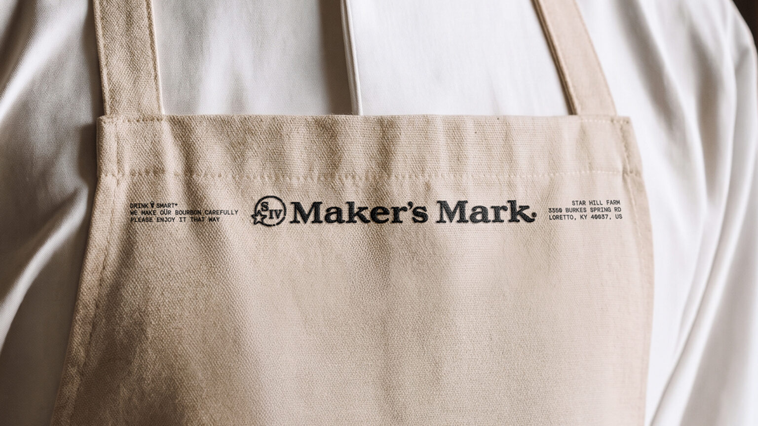
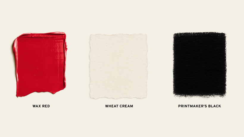
The Maker’s Mark palette is now rooted in the memory of the bottle: Wheat Cream as the ground, true to the label; Printmaker’s Black for the type; Wax Red for the marks and handwriting. Layouts introduce a letterhead, with the Samuels family’s SIV mark at the centre and the distillery’s address set in the corner – acknowledging the importance of place.
The result: an elevated, inviting world of ritual and care with room for expression and the joy of making. It’s as much Maker’s as the bottle itself.

Photography by Scott Grummett @ Bailey Wade
Typography by Nick Cooke @ G-Type Foundry