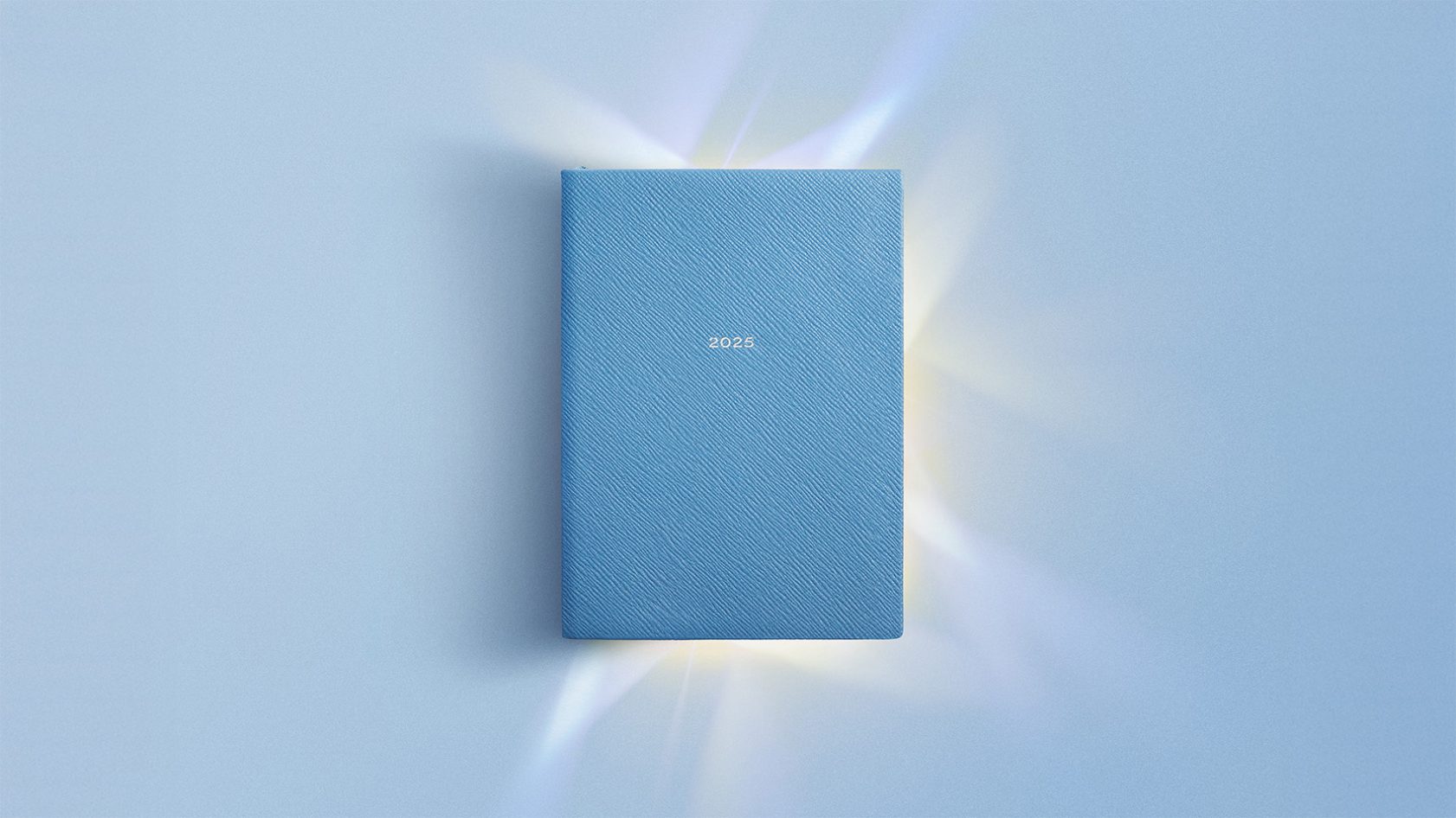
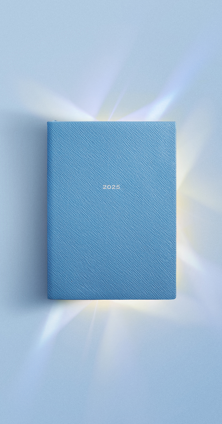
Smythson has long been a keeper and organiser of days. But for all its sense of order, the brand itself lacked an organising idea. So we turned to where the Smythson story begins: the diary – and built a refined identity system to express it.

A word rooted in diarum (‘to shine’) and dies (‘day’), the diary is - in essence - an object of days kept and pages treasured. A meaning that shines even brighter in light of Smythson’s silversmith founder, Frank Smythson.
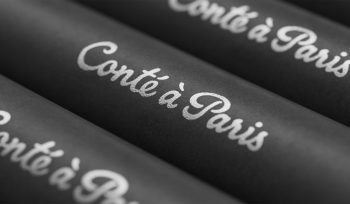
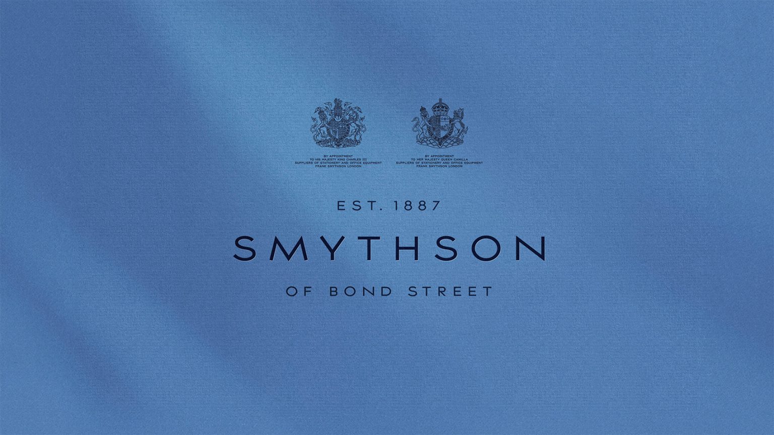
The wordmark was re-cut for balance and composure, joined by two typefaces - a copperplate titling face that echo's engraving tradition, and a literary serif worthy of fine book printing.

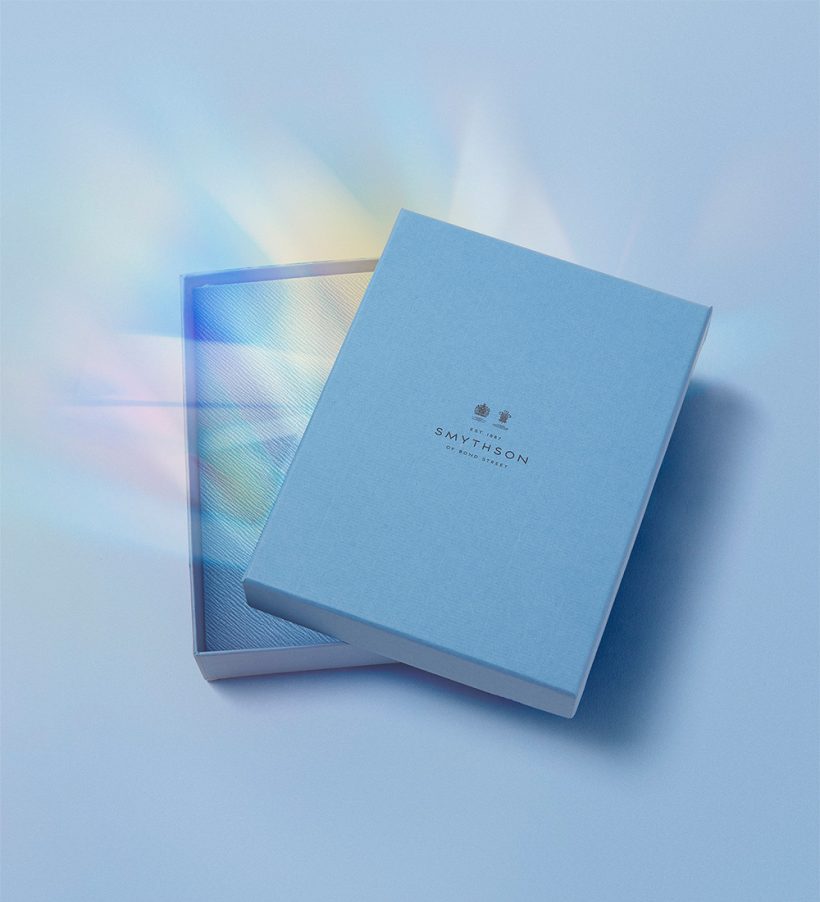
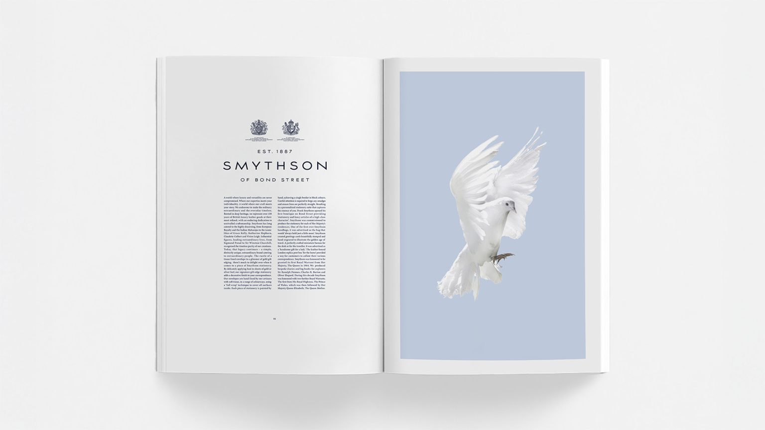
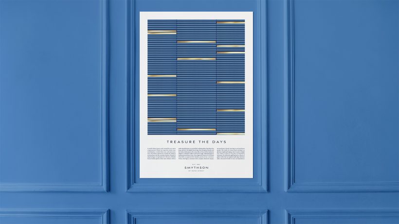
Across every touchpoint, Smythson Blue – a colour of thought, imagination and clarity – was elevated to halo status. Whilst exquisitely arranged compositions capture a lightness of spirit; the quiet pleasure of arranging and keeping.
An identity that re-inks Smythson’s sense of purpose – a brand that not only organises days, but offers more beautiful ways to treasure them.