The circus is back

Tim Owen
Tim Owen

I remember, in one of my first few weeks as a planner, about twenty five years ago, talking to friends one evening about how I had been working on the design of the Lynx packaging. And how they were adamant (and impressed) that I meant I had been working on the ads. After a moment of basking in the glory of my contribution to BBH’s seminal work, I realised that people didn’t think of consumer brands as being designed, but just emerging, immaculately, from factories. And I imagine it would still be a surprise to most people outside our industry exactly how much weighty work goes on behind things that are lifted from shelves with such lightness of thought.

Because behind every beer, cereal, chocolate, etc., of a decent size, there are teams of people poring over Ehrenberg Bass test results and multivariate models of category space; squinting at half-formed concepts magic-taped to a wall; reading the tea leaves of consumer research, trying to get heads into some collective consciousness; looking at inks and substrates under different lights; drop-lifting objects into fixtures, kitchens, bars. And making things, always making : trying things out, getting excited, getting stumped, trying something else, getting excited again. Playing around at the intersection of memory and material, design and media, brand and culture. And that’s just the people involved in the design process. Because doing all this properly, creatively, pays dividends. Lots of little improvements to visibility, legibility, irrational appeal, attribution in communication, etc., let alone big improvements, can equate to millions in sales.

One of the highlights for agency folk of all this work is a trip to the archives. Consumer brands – again, in contrast to the lightness of buying – can have substantial archives. Carlsberg’s was like an antiquarian bookshop. Kellogg’s held an astonishing variety of advertising art; beautiful gouaches of corn, girls, bowls of cereal. Even those without dedicated rooms and archivists have history books, old packaging, old posters, old reels, letters, ephemera, etc.

And what these things offer up – aside from the chance of a rare find (a lost origin story, a lost graphic mark) is a sense of the long view of the brand. The platonic form, the platonic idea, of the brand, moving through time and space, media and culture.

Jim Beam's typography "calls-and-answers" across the page because it's a brand that likes to talk”

Tim Owen
Tim Owen

Because as Jessica Spence, one of our long-standing clients, put so well, we are really only custodians of a brand. We take its past, and its present, and – if we do our job well – give it a future, in culture. True success is when the CMO of twenty years time appreciates the work we’re doing today.

And when you have seen a lot of these line-ups of brands-over-time, you start to see that all the brands change in the same way, at the same time, to the same inflexion points. Like a shoal of fish, moving with the currents. And not only that, but you get a sense that there are, broadly speaking, three ages of branding, certainly in the consumer goods space.In the first age brands are oJered up as a kind of social contract, in a world where street chocolate was more likely to contain sawdust and lead paint than chocolate. Here the manufacturers advertise, package and make famous a better chocolate. And the customer gets the sense that no-one with such an impressive neoclassical factory with such tall chimneys and such bearded founders and such promises of quality would risk their reputation selling chocolate made of sawdust, and hands over their threepenny bit. The design of the brands in this first age, in package and print, is part salesmanship and part showmanship; where the showmanship wins out (unsurprisingly, given a largely illiterate audience). This is the age of Fry’s Five Boys : five boys in sailor stripes running the gamut of pre-chocolate emotions. The age that brings the world Coca-Cola and its famous bottle. The age of Lyle’s Golden Syrup, with its strange rotting lion. Later of Polo, the mint with the inexplicable hole. And a host of other unforgettable characters. It is branding-as-circus – roll-up, roll-up, drawing a crowd – with occasional hints of freakshow. And a golden age of entertaining, right brain creativity.

In the second age of branding the platonic forms persist (there is still a glass and a half full of milk on Dairy Milk, still a keystone on Heinz, of course) but things are modernised. The last few leaves of Victoriana fall away from the labels, serifed logotypes get an Astrid Kircher haircut, colours start to pop. And the role of packaging changes as it gets a walk on part in the last few seconds of a TV commercial. This is packaging as logo-on-a-box; made for flickering black and white cathode ray tubes. And made easy, for self-selecting shoppers to find in the new supermarkets. It is a much moreleft-brained, rational, and less social design world; the salesmanship returns, the showmanship recedes – and the circus moves on (to the advertising; for a while).

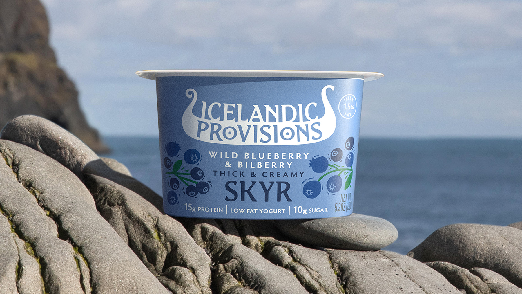
The third age is where we are now, or where we are heading, and it’s a return – in part – to that original golden age of consumer branding. Unsurprisingly as the conditions are not dissimilar : with the audience not reading much, not thinking much, and with the epicentre of brands moving to social space. It’s not hard to see the parallels between the once-seen-hard-to-forget showmanship of brands like Tony’s Chocolonely, Liquid Death, and our own Icelandic Provisions, and the roll-up, roll-up branding of a hundred years ago. But more so, in an age where not-being-normal, and entertaining the right brain, pays such dividends in media and culture. It’s an exciting time to be doing what we do – as it always is when the circus returns to town.