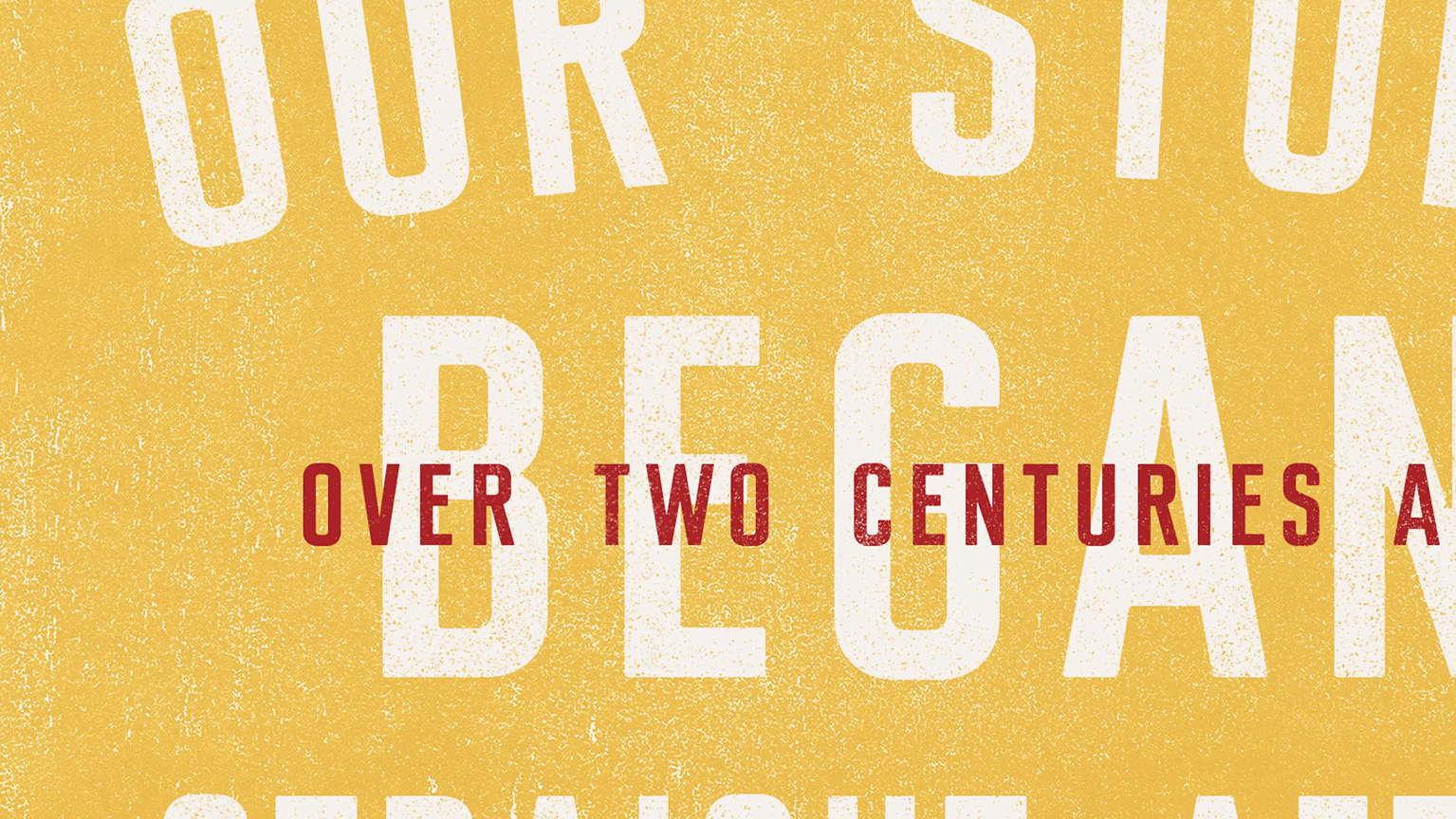
Jim Beam has a story like no other. Crafted in one place, by one family, for 225 years – and eight unbroken generations. A whiskey – legend has it – first bottled on the Beam family porch. The spirit of which is there in every drop of Jim Beam. It’s the kind of easy, inviting whiskey that says “hey, come on over, come on up, we’d love to have ya”.
So our invitation; to bring more soul, and more spirit of the porch, to the brand.
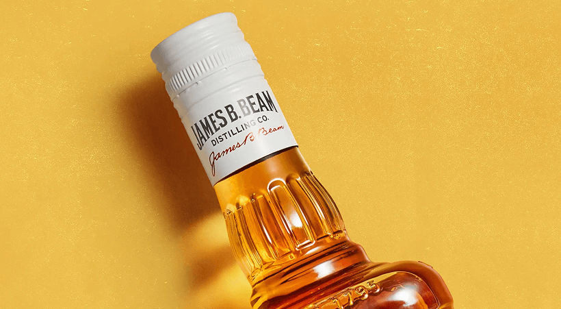
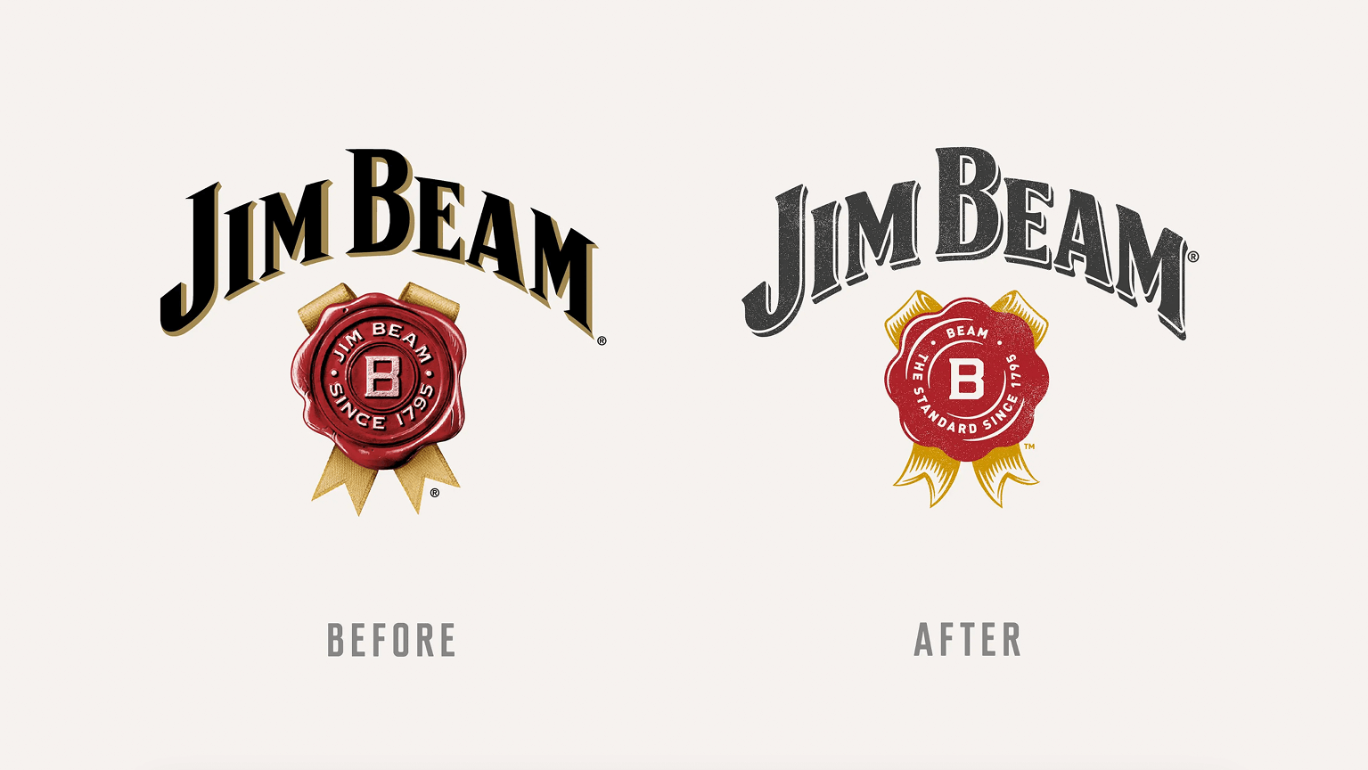
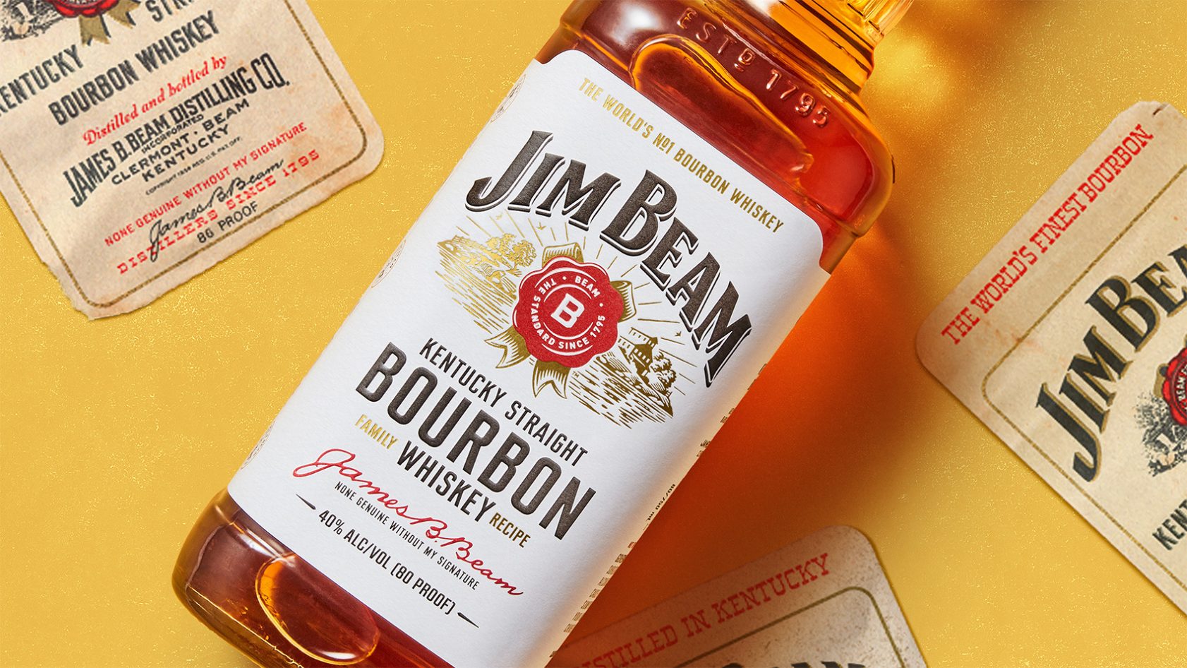
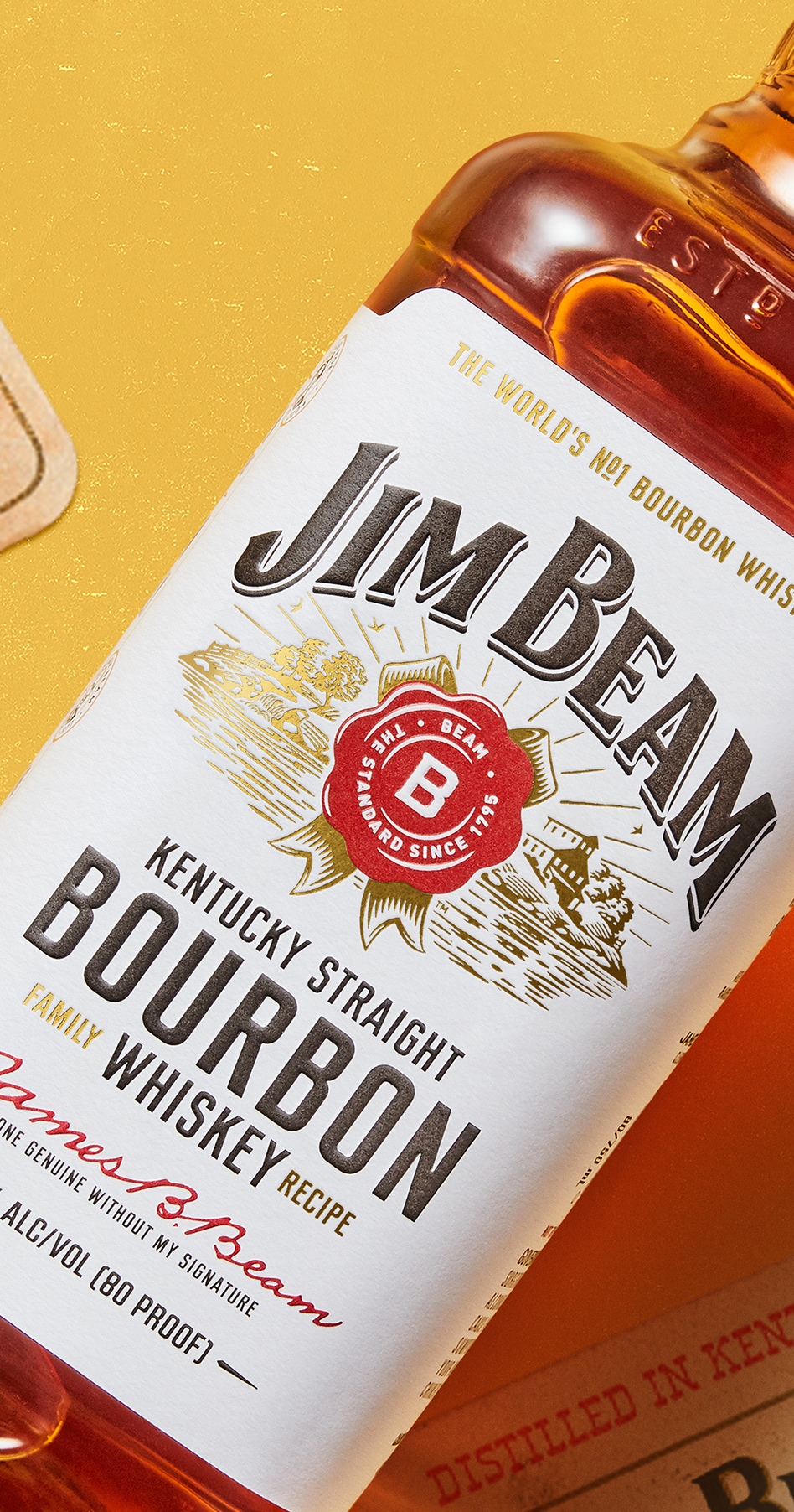
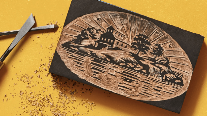
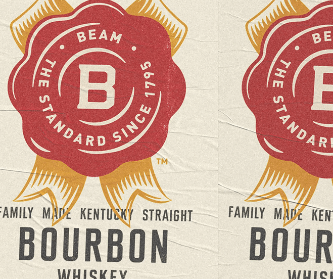
We found that soul by taking a long view of the brand, its bottles, and its labelling. And there, roughly two generations back, was a label with something of that well-loved, worn-in, warmth of the porch. Inspired by this – and using methods true to its local, grounded, story : woodcut and letterpress – we set about recrafting the world of Jim Beam.
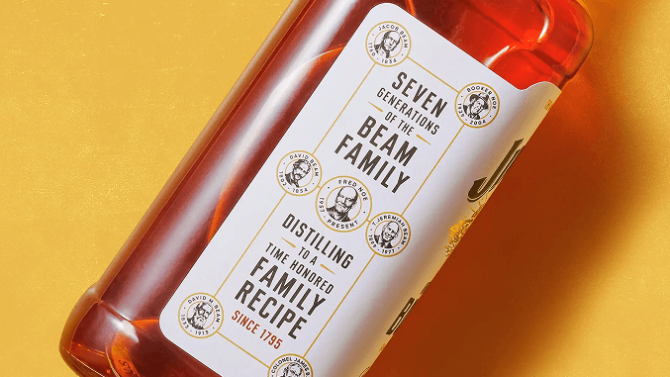
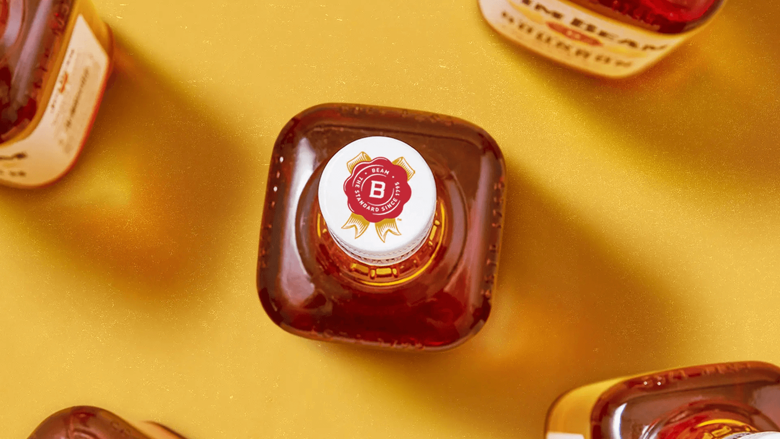
Simplifying and softening its logo, cutting a new typeface inspired by double-spaced lettering from the archives (and setting it in an easy, conversational way), picking an unmistakable palette, from the tones of the bottle, and inking up new wood engravings, to tell the brand’s many stories.
Telling the story of the spirit of the porch alongside the unmistakable marks of Jim Beam, enhanced all the brand’s familiarty - a generous, inviting soul true to Kentucky, true of the family and true of the brand.”
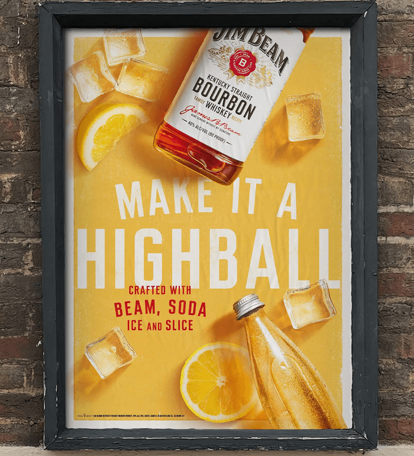
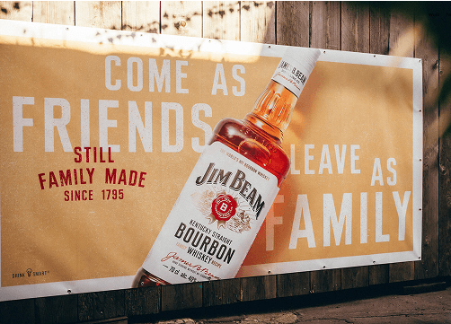
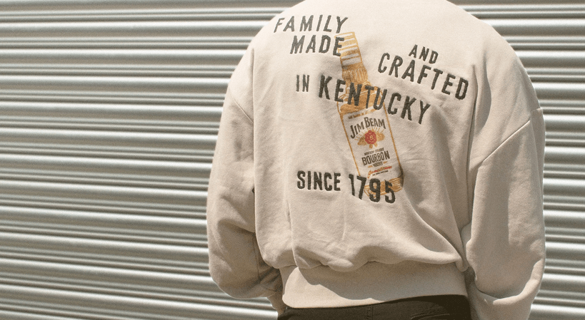
Then we took this look to every corner of the Jim Beam world. From posters to sneakers to coolers – the spirit of the porch : "family, friends, neighbours and strangers welcome, for 225 years".