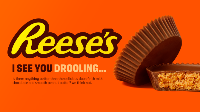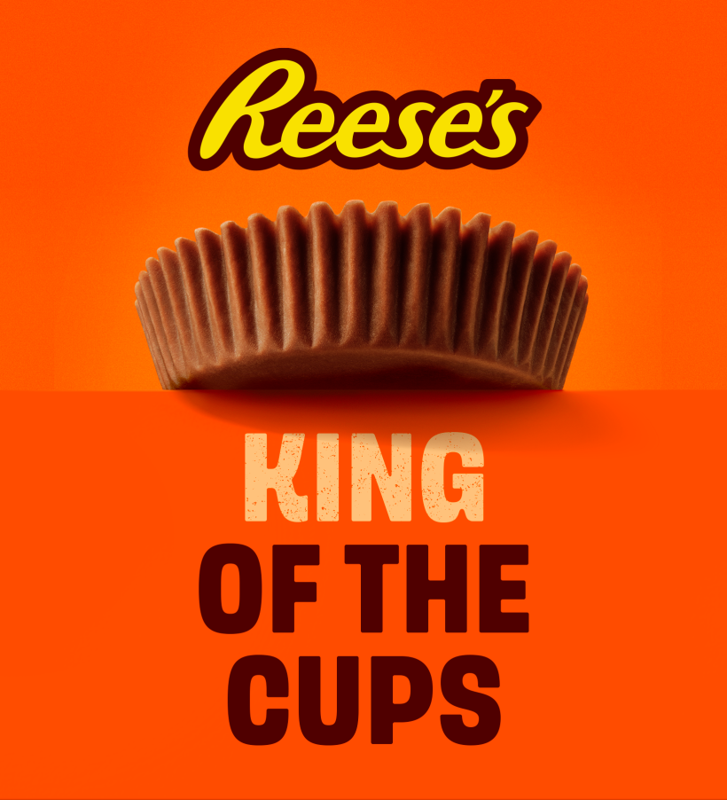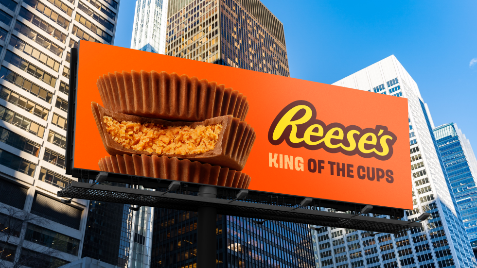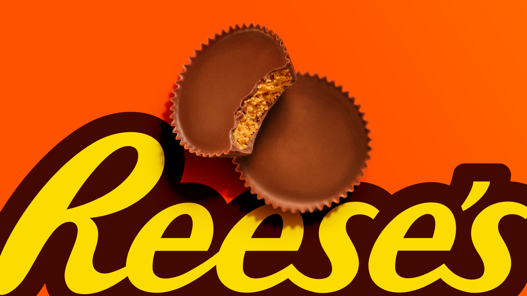
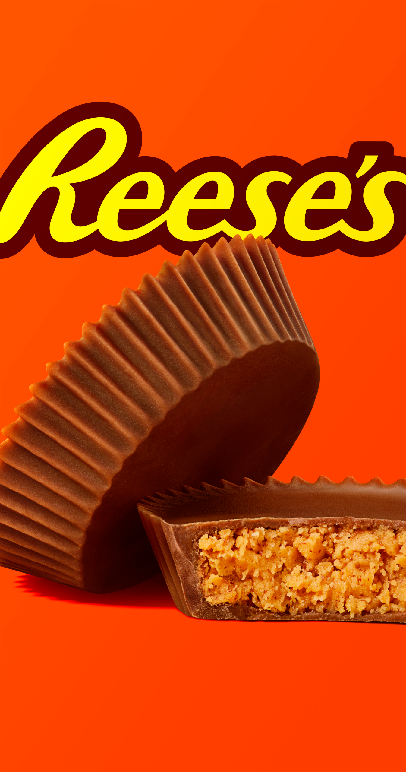
Some brands need no introduction. Reese’s – with its unmistakable orange and legendary Peanut Butter Cup – is one of them. But to stay iconic, brands must evolve. When research revealed that the Cup itself had grown into a powerhouse visual asset, the question arose: why wasn’t it celebrated more widely? The challenge was to center the Cup in the brand world while adapting the identity for a modern, digital landscape.

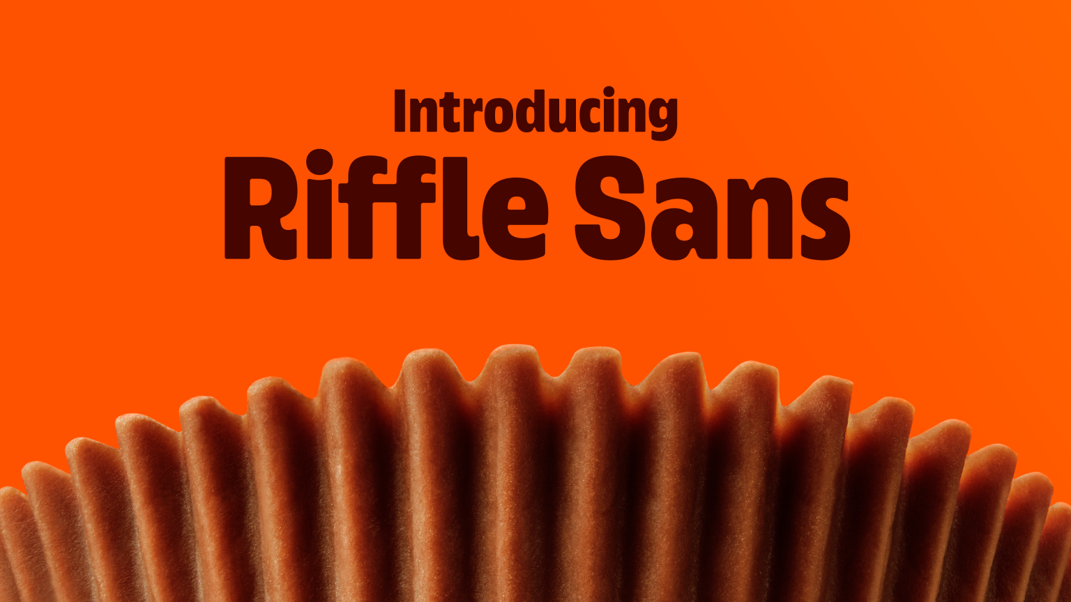
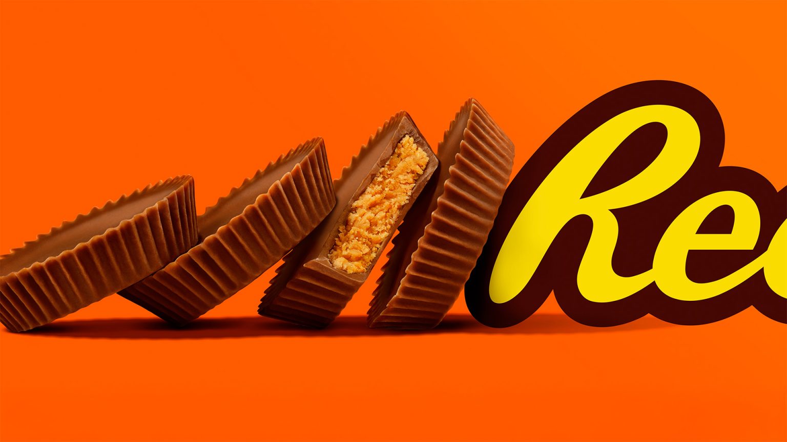
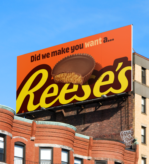
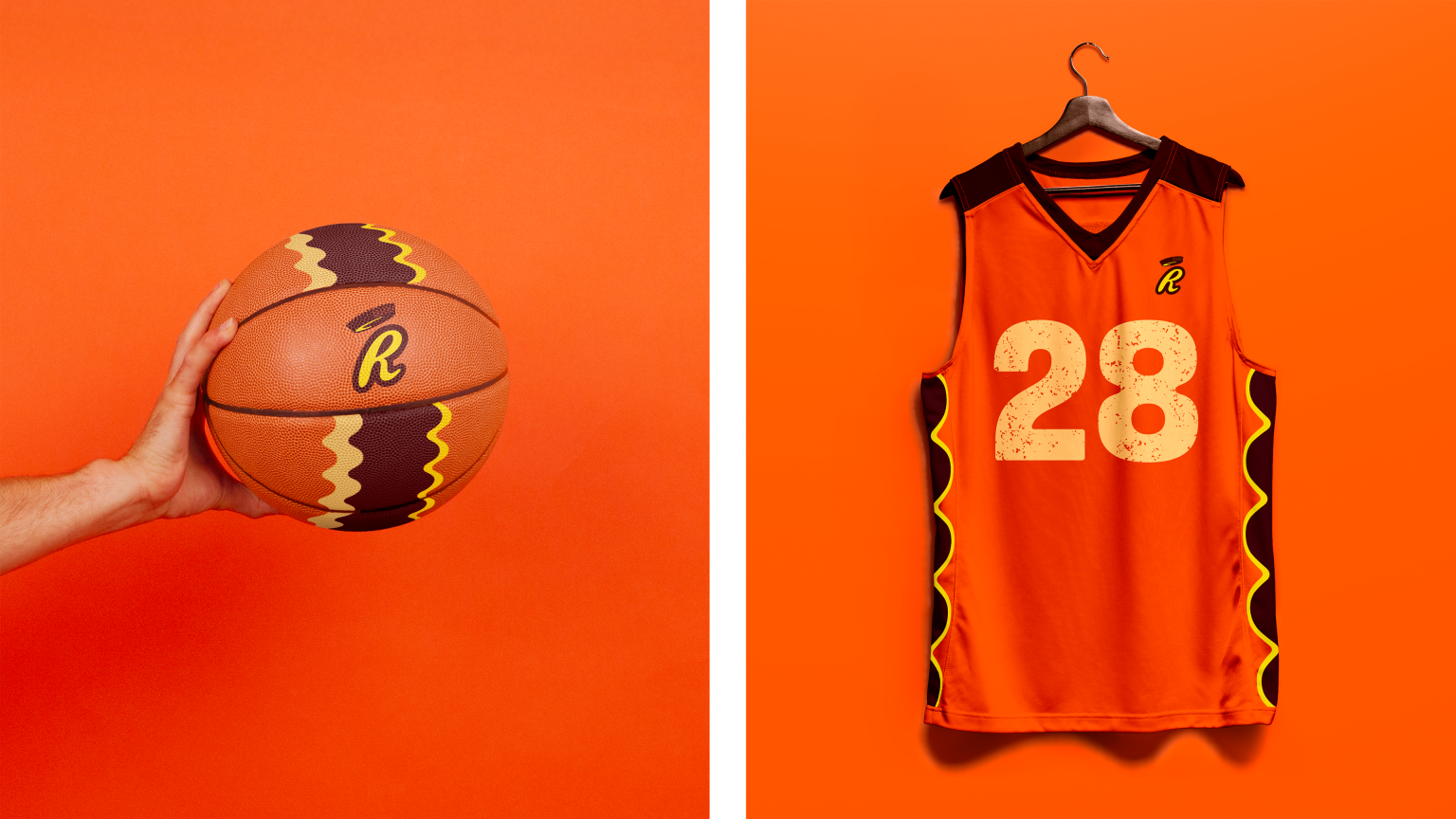
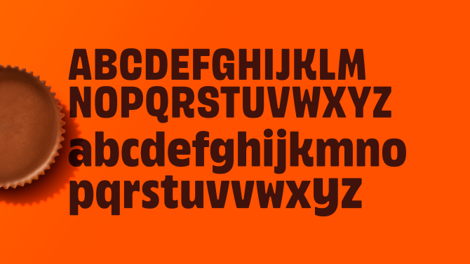
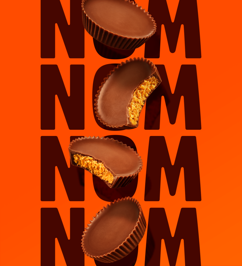
We placed the Peanut Butter Cup at the core of the refreshed identity. To strengthen visual presence, we created a custom typeface, Riffle Sans. Its rounded letterforms reference the Cup’s iconic riffled edges, reinforcing the brand with every word. This is paired with dynamic product photography celebrating the Cup from every irresistible angle.
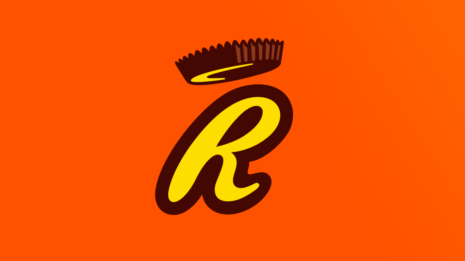
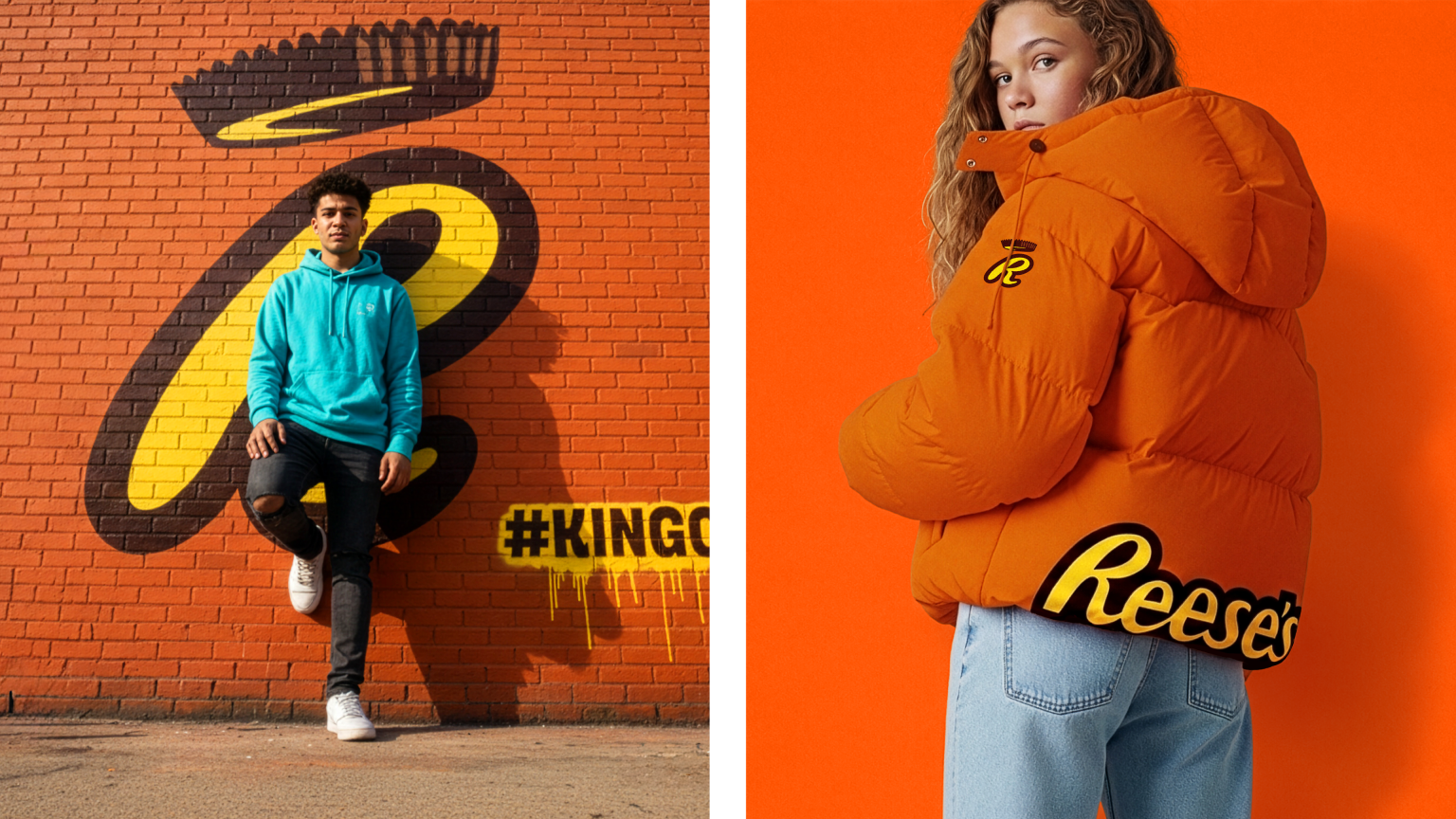
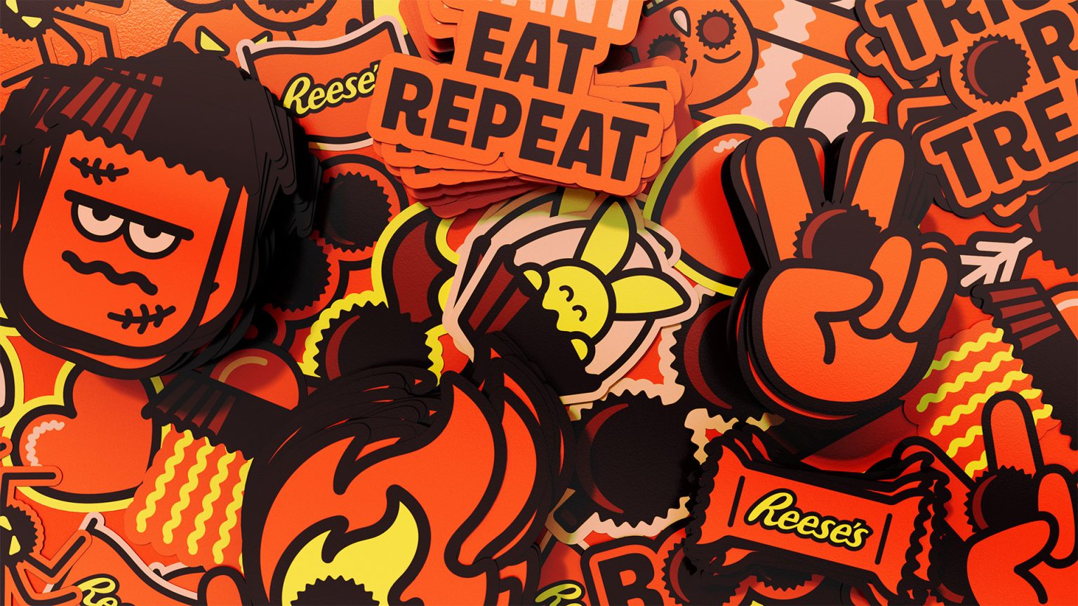
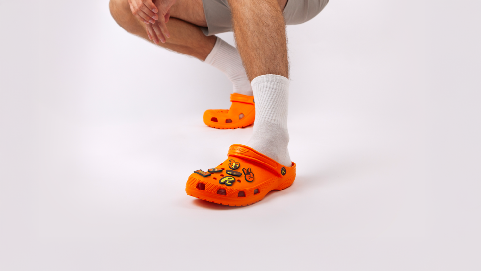
For digital contexts – where horizontal logos lose impact – we developed an intuitive shorthand icon: the Reese’s ‘R’ topped by a graphic Cup. Nicknamed ‘the Champion Crown’, it ensures the brand remains unmistakable on even the smallest canvas. A playful social toolkit completes the look, reminding people exactly why Reese's is iconic and providing the brand with everything it needs to show up at every touchpoint.